

Understanding Responsive Design: Beyond Shrinking Screens
To really get what responsive design is all about, stop thinking of it as a shrinking machine. Instead, picture a skilled architect. An architect doesn’t just scale down the blueprint of a grand ballroom to design a studio flat; they reimagine the entire space, optimising the flow and function for its new, smaller dimensions. In the same way, effective responsive design principles are about much more than just squeezing content onto a tiny screen. They're about reshaping the user experience so it feels natural and purpose-built for every device, from a wide desktop monitor to a compact smartphone.
This approach is centred on the user, not just a technical checklist. Instead of simply making everything smaller, it forces a re-evaluation of the whole layout. It’s about making sure text is easy to read, buttons are simple to tap, and finding your way around the site is straightforward, no matter where or how you're viewing it. For anyone building for the modern web, exploring the crucial importance of responsive design and its benefits is a foundational step. A site that just shrinks can quickly turn into a frustrating puzzle on a mobile phone, killing user engagement. A truly responsive site, on the other hand, guides the user effortlessly.
The Core Components of Responsiveness
At its heart, this design philosophy rests on three main pillars that work together to create fluid, adaptable online experiences.
This infographic breaks down the key responsive design principles and how they fit together.
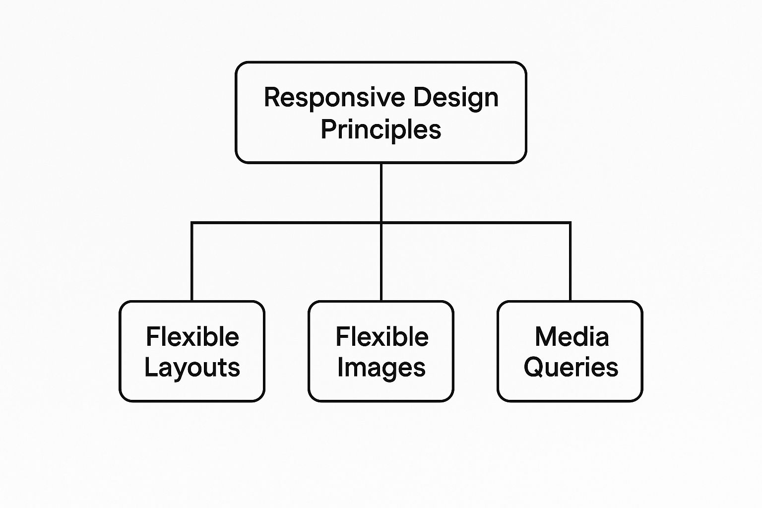
As the diagram illustrates, these three elements—flexible layouts, flexible images, and media queries—are the essential tools for building websites that can gracefully adapt to any screen.
These components aren't just technical items; they represent a fundamental shift in thinking. Rather than designing for a fixed-size canvas, developers create a flexible system that can react to any viewing environment. This results in a more durable and future-ready website that doesn't just work on new devices, but shines on them. For businesses in the UAE, putting these principles into practice correctly is a critical factor to improve website ranking and connect with the massive mobile-first audience. In the end, a responsive site respects the user's choice of device, delivering a consistently excellent experience that builds trust and helps drive business goals.
The Mobile-First Revolution: Starting Small To Win Big
Traditionally, designers would create large, sprawling desktop websites and then attempt to pare them down for smaller screens. This "graceful degradation" method often felt like trying to squeeze an entire living room's worth of furniture into a tiny studio flat—awkward, cluttered, and impractical. The mobile-first revolution completely flips this on its head. This modern approach, which is at the heart of effective responsive design principles, starts with the smallest, most restricted screen: the mobile phone.
By designing for mobile first, you are forced to make smart, tough choices right from the start. What is the most critical piece of content? What is the single most important action a user needs to take? This constraint isn't a weakness; it's a powerful filter. It forces you to cut the clutter and focus the entire experience on what truly matters. The mindset shifts from "What can we add?" to "What is absolutely essential?". This naturally results in cleaner designs, faster load times, and more intuitive user journeys because the core experience is solid before any complexity is introduced for larger screens.
A Content-First Philosophy
At its core, a mobile-first strategy is a content-first strategy. When screen space is at a premium, you have no choice but to prioritise your content with surgical precision. This requires a deep understanding of what your users need and what your business goals are.
The image below shows how a simple layout prioritises the most important elements for a mobile view before expanding for larger screens.
This screenshot shows how a multi-column desktop layout neatly collapses into a single, scrollable column on mobile devices. This ensures the core content remains easy to access and read. As the screen size increases for tablets and desktops, extra information and more complex layout features are gradually introduced. This progressive enhancement improves the experience for larger screens without overwhelming the mobile user, making every feature feel deliberate and well-placed.
Why Mobile-First Matters in the UAE
This focus on mobile is particularly important in markets with high smartphone usage. The digital environment in the United Arab Emirates, for instance, is overwhelmingly mobile-centric. With smartphone adoption in the MENA region surpassing 70% and mobile internet subscriptions reaching over 60% of the population, designing for mobile isn't just a good idea—it's a requirement for business survival. A mobile-first approach ensures that the largest segment of your audience gets the best possible experience right away. You can find more details about the mobile economy in the Middle East and North Africa on gsmaintelligence.com.
The principles of prioritising user experience and performance are consistent across different mobile platforms. Further valuable perspectives can be found in expert mobile app development tips, which often tackle similar challenges in creating simple, effective interactions for users on the move. By building from the smallest screen up, you create a stronger, more flexible foundation for every user, no matter what device they are using.
Fluid Grids: Creating Layouts That Feel Natural Everywhere
At the heart of every well-executed responsive design lies the concept of the fluid grid. Imagine trying to fit a rigid, framed photograph into a smaller picture frame. You'd either have to crop out important parts of the image or shrink the whole thing down, making the details impossible to see. A fixed website layout works in much the same way.
A fluid grid, however, is more like a high-quality piece of stretch fabric. It can expand and contract to fit different frames perfectly, all while keeping its core pattern and structure intact. Nothing looks squashed, stretched, or out of place. This inherent flexibility is what allows a website layout to feel so natural, regardless of the device it's viewed on.
Instead of defining parts of a layout with fixed, unchangeable pixel widths (like a 960-pixel-wide container), a fluid grid uses relative units, most commonly percentages. This clever shift means that columns, images, and other containers automatically resize in proportion to each other and, most importantly, to the size of the screen. The goal is to create a visual harmony that remains consistent, whether you're on a huge desktop monitor or a small smartphone.
Making Grids Truly Fluid
Simply switching to percentages is a start, but a truly effective fluid grid is built on a foundation of thoughtful mathematical relationships that protect the design's integrity. For example, if a main content area occupies 70% of the screen and a sidebar takes up the remaining 30%, that 70/30 ratio will hold steady across all devices, delivering a predictable and comfortable user experience.
Thankfully, modern CSS tools have made building these intelligent grids much more accessible. Technologies like CSS Grid and Flexbox provide powerful and straightforward ways to create complex layouts that were once incredibly difficult to code.
This screenshot, from an excellent guide on CSS-Tricks, shows the basic code structure for a CSS Grid layout.

The code illustrates how developers can define columns and rows that adjust automatically, establishing a sturdy framework for responsive content. By defining the layout in these flexible terms, the design avoids the awkward breaking or unnatural stretching that often plagues less sophisticated websites. This foundational principle ensures your website's structure is both resilient and adaptable, ready for any screen it might encounter.
Flexible Images and Media: Visual Content That Actually Works
If fluid grids are the skeleton of a responsive website, then flexible images and media are what give it personality and visual flair. But when handled incorrectly, they can break an otherwise seamless user experience. An image that looks perfect on a desktop can become a data-guzzling monster on a mobile device, slowing your site to a crawl. On the other hand, an image that’s too small will look pixelated and unprofessional on a large screen. This balancing act is a central challenge in responsive design principles.
The most straightforward technique is to give an image a maximum width of 100% of its container using CSS. This simple rule is a great starting point, as it stops images from spilling outside their designated space and ensures they scale down as the screen gets smaller. However, it's a one-size-fits-all solution that doesn't consider performance or artistic detail. A massive, high-resolution image might look fine when scaled down, but the visitor still has to download the entire oversized file, which is a waste of bandwidth.
Smarter Solutions for Responsive Images
Truly responsive design calls for more refined methods. Modern web development provides powerful HTML attributes like srcset and sizes that let you offer the browser a menu of different image sources. This allows the browser to intelligently pick the best image file based on the user's screen resolution and size, a practice known as resolution switching.
The code example below demonstrates how you can specify different image files for various screen widths.
By using the srcset attribute, a developer gives the browser a list of image options to choose from. This optimises both the visual quality and the loading speed. It means a user on a small device with a slow connection gets a smaller, faster-loading image, while someone on a high-resolution desktop sees the crisp, detailed version they expect. This intelligent delivery system is essential for making visual content work flawlessly everywhere, moving beyond simple scaling to true adaptation.
Mastering Breakpoints: Content-Driven Design Decisions
Think of breakpoints as the strategic tempo changes in a piece of music. In responsive design, they aren't just markers for a specific screen size; they are the precise moments when a layout should transform to better suit the viewing space. These are the points where your website’s content and structure rearrange to provide the best possible experience. The most effective responsive design principles treat breakpoints not as rigid rules set by device manufacturers, but as natural cues from the content itself.
A common pitfall is to rely solely on the standard breakpoints provided by popular frameworks. While these presets offer a convenient starting point, they are generic by design and often fail to serve your unique content needs. A layout should "break" when it starts to look awkward—when lines of text become uncomfortably long, when columns get too squashed, or when images no longer fit gracefully. This decision should be driven by your content, not by a predetermined device width.
From Device-Centric to Content-Centric Breakpoints
The crucial shift in modern web design is moving away from designing for specific devices (e.g., an "iPhone breakpoint" or a "tablet breakpoint") towards a content-first approach. Instead of using a fixed set of screen widths, the best practice is to start with your smallest screen design and gradually widen the browser window. The very moment the layout begins to feel strained or visually imbalanced—that’s your first custom breakpoint. This method ensures your design feels intentional and well-composed at every possible size, not just at common device widths.
Many developers start with a framework's default breakpoints, such as those provided by Bootstrap, as a foundation.
While these defaults offer a structured start, the key is to view them as suggestions, not strict requirements. True mastery comes from adding your own breakpoints where your specific content demands them. By letting your content guide these transitions, you create a genuinely seamless and durable user experience that stands the test of time, no matter what new devices enter the market.
To effectively plan your breakpoints, it's helpful to think strategically about how content should adapt across different screen sizes. The table below outlines a content-first approach to breakpoint planning.
Strategic Breakpoint Planning
A comprehensive guide to selecting and implementing breakpoints based on content needs and user behaviour patterns.
| Breakpoint Range | Target Use Case | Content Strategy | Performance Impact |
|---|---|---|---|
| 320px – 480px | Small Mobile Screens | Prioritise a single-column layout. Focus on vertical rhythm, large tap targets, and critical content first. Navigation is often collapsed into a "hamburger" menu. | High: Load only essential CSS and optimised, smaller images. Defer loading of non-critical scripts and assets to ensure fast initial render times on mobile networks. |
| 481px – 768px | Large Mobile & Small Tablets | Introduce a two-column layout for less critical content (e.g., sidebars, related articles). Text line length becomes a key factor. May introduce slightly larger images. | Medium: Can begin to load slightly higher-resolution images. More complex CSS for grid layouts may be introduced, but should still be mindful of payload size. |
| 769px – 1024px | Tablets & Small Laptops | Expand to more complex multi-column layouts (e.g., three columns). Navigation can expand out of the hamburger menu. Content density can increase. Ideal for rich media experiences. | Medium-Low: Higher-resolution images and more complex JavaScript interactions (like carousels or interactive maps) can be loaded, as connection speeds are typically more stable. |
| 1025px and above | Desktops & Large Monitors | Utilise the full screen width with complex grid systems. Display all navigation elements, sidebars, and supplementary content. Ideal for data-heavy dashboards or immersive visuals. | Low: Assumes high-speed internet. This is where full-resolution images, background videos, and heavy JavaScript libraries can be loaded without significant negative impact on user experience. |
By tying breakpoints to content needs rather than device specifications, you build a more resilient and user-friendly design. This approach ensures that the layout serves the content, not the other way around, leading to a better experience for every visitor.
Performance Optimization: Speed That Scales With Design
A stunning responsive design that takes forever to load is like a sleek sports car stuck in traffic—all potential with no power. This brings us to a crucial responsive design principle: performance optimisation. Speed is not just a technical detail; it’s a central part of the user experience. A design that feels slow on a 4G connection will be nearly useless on a weaker network, defeating the very purpose of accessibility that responsive design is meant to deliver.
Every choice, from a large background image to an unoptimised script, directly affects how quickly people can use your site. For this reason, performance can't be an afterthought. It must be woven into the design process from the very start. This involves adopting strategies that make your website not only visually adaptive but also lightweight and fast on any device.
Balancing Richness With Speed
Achieving top performance is about making smart trade-offs. You don’t have to give up a rich visual experience, but you do need to be deliberate about how you present it. Key strategies include:
- Efficient CSS and JavaScript: Keep your code clean and tidy. Minify your files to strip out unnecessary characters and combine them to lower the number of server requests. Most importantly, delay the loading of non-essential JavaScript so the main content of your page can show up without a wait.
- Smart Image Delivery: As we've covered, use modern image formats like WebP and apply responsive images with
srcset. This makes sure users only download the image size they actually need, which is a huge factor in page load times. - Performance Budgets: Set firm limits for your page size, image weights, and the number of requests. A performance budget acts as a safety rail, compelling your team to make performance-aware decisions throughout the project. You can check your site’s metrics with Google’s PageSpeed Insights tool.
Here is an example of what the PageSpeed Insights tool looks like, showing how it measures key performance indicators.
This analysis highlights important metrics like First Contentful Paint and Speed Index, giving you a clear picture of your site's performance and areas that need attention.
This focus is especially important in a region with varied internet quality. While the UAE has advanced digital infrastructure, challenges remain across the wider Middle East and Africa, where patchy internet access is common. Sticking to performance-focused design principles ensures your site stays accessible to everyone. You can learn more about regional technological differences and their impact by reviewing the latest research on the MEA adaptive learning software market.
Ultimately, a fast website leads to higher engagement, better conversion rates, and improved search engine rankings. For a closer look at specific techniques, you might find our detailed guide on website speed optimisation helpful.
Business Impact: Why Responsive Design Drives Real Revenue
Moving from technical details to financial results, the real worth of responsive design principles is seen in actual business performance. A website that adapts smoothly to any screen is more than just a point of pride; it's a powerful tool for generating revenue. When people have a positive experience on their mobile devices—where a huge amount of online activity now takes place—they are much more likely to stick around, interact, and ultimately make a purchase. This directly leads to more sales, increased leads, and stronger customer loyalty.
A well-executed responsive design removes the frustrating obstacles that make users leave. Picture a potential customer trying to buy something on a website that isn't mobile-friendly. They're constantly pinching, zooming, and fumbling to tap tiny buttons. In most cases, they'll just give up and head to a competitor's site. A responsive website gets rid of this friction, creating an easy journey from discovery to checkout.
Measuring the Return on Investment (ROI)
To fully understand the financial effect, it's vital to track key performance indicators (KPIs) that link design improvements to business objectives. Stakeholders want to see concrete numbers, not just pretty layouts. You can monitor this progress with analytics tools that offer clear data on how users behave across different devices.
The image below, from Google Analytics, shows a standard dashboard where you can compare metrics like conversion rates and user engagement between desktop, mobile, and tablet visitors.
By keeping an eye on these device-specific reports, you can identify exactly how responsive updates are improving mobile conversions or lowering bounce rates, offering solid proof of your return on investment.
Tangible Growth in the MENA Region
This impact is especially noticeable in the fast-growing digital economy of the UAE and the broader MENA region. As businesses shift to a digital-first approach, online accessibility has become a key element of growth. Studies from 2019 found that Middle Eastern companies that adopted digital tools, including responsive websites, experienced an estimated 5% annual increase in revenue productivity. This rise is directly tied to better online access and an improved customer journey on mobile devices. You can discover more about the economic impact of digital adoption from the World Bank.
For e-commerce businesses in particular, a responsive design is essential for success. A smooth and intuitive mobile shopping experience is directly linked to lower cart abandonment rates and higher average order values. If you operate an online store, our guide on how to optimise an e-commerce website might be of interest for boosting performance and sales. In the end, putting money into responsive design isn't just a cost—it's a strategic move towards greater customer satisfaction and lasting business growth.
Key Takeaways: Your Responsive Design Action Plan
Putting theory into practice is the final step in getting a real grip on responsive design principles. Think of this section as your roadmap, turning the core concepts we've discussed into a clear plan of action. Whether you're kicking off a brand-new project or refining a website that’s already live, these steps will help you focus your energy for the best results.
Project Checklist: The Essentials
Before you write a single line of code, run through this checklist. This isn't just about ticking boxes; it's about committing to an approach that puts your users first.
- Prioritise Mobile-First: Always begin your design and content strategy with the smallest screen in mind. This forces you to concentrate on the most critical content and features right from the start.
- Define Content-Driven Breakpoints: Forget about designing for specific devices like "the iPhone layout" or "the tablet layout." Instead, let your content be the guide. As you resize your browser window, the moment your layout starts to look awkward or strained, that's where you add a breakpoint.
- Establish a Performance Budget: Set firm limits for things like page weight, image sizes, and load times before the project even begins. This ensures your design stays quick and accessible for every user, regardless of their connection speed.
- Audit Your Media: Make sure you're using modern, efficient techniques. This includes
srcsetfor serving appropriately sized images and lazy loading for videos and other media. Every visual element should earn its place without slowing down the experience.
Warning Signs of a Failing Responsive Design
Even with the best intentions, a design can fall short. Stay alert for these common issues that signal a frustrating experience for your visitors:
- Horizontal Scrolling: If a user ever has to scroll sideways on any device, your layout is fundamentally broken. This is a classic symptom of using fixed-width elements that don't adapt.
- Unreadable Text: Text that’s too small on a mobile screen makes people pinch and zoom. On the other hand, lines of text that are excessively long on a wide desktop screen are tiring to read. Both are signs of poor typography.
- Tiny Tap Targets: Buttons, links, and other interactive elements that are too small or packed too closely together are a nightmare on touchscreens. This leads to missed taps and immense user frustration.
- Slow Mobile Performance: If your site feels sluggish when loaded over a mobile network, your optimisation efforts have missed the mark. Speed is a non-negotiable part of good responsive design.
By actively following this checklist and keeping an eye out for these warning signs, you’re not just building a website. You’re creating a resilient and user-friendly digital experience that stands the test of time and technology.
Ready to put these principles into action with a team of experts? Technogital F.Z.C specialises in creating high-performance, responsive websites that deliver real business results. Contact us today to see how we can transform your online presence.